Facebook is changing it’s new design to web version permanently. We have known it for a long time, after many years dragging a design that already looked a bit old, Facebook has finally decided to update the appearance of its social network with an appearance somewhat more in line with what we can see in its version for devices mobiles.
While we will still have to wait until September to say goodbye to the classic version , some lucky ones have already been able to take a look at what the social network will look like with the new design.How is it possible? Certain users have received an invitation to access the new Facebook design upon logging into their account. If you are one of the chosen ones, you will notice immediately, since when you access your profile you will get a message with the notification. By doing so, you just have to accept the invitation.If this is not your case, don’t worry, because today we are going to explain in detail all the changes made to the new interface through 5 points that define the new user experience on Facebook . We started!
More visual more interactive
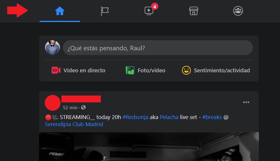
The first thing that stands out from the new Facebook design is its enormous resemblance to the application for mobile devices. Programmers have understood that the users that make up their social network are more familiar with the mobile version, so why not unify the appearance of both versions?To begin with, the design is totally responsive, since if we manipulate the size of our browser window, the icons distributed by the social network adapt to it. This will make Facebook look great from any computer and resolution .Another important change has to do with the interaction of users with the publications on their wall. When viewing a photo or video, they will be executed in full screen with a comment thread located on the right of the screen without intervening too much in the content, so that we can interact easily and simply.
Dark Mode
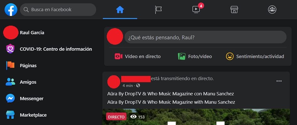
The inclusion of a dark mode is something that we can find in almost any application. For this reason, the social network of Mark Zuckerberg has implemented a new dark mode within the new Facebook design with which you can change the white background to a black background, and thus avoid the problem of eye strain. As we say, this very useful option will allow your eyes to rest more, especially when you use the social network at night or in any dark environment . To activate and deactivate it, click on the arrow in the upper right corner and you will see the switch that says “Dark Mode”.It must also be said that the first time you activate the new aspect of Facebook, the social network will allow you to choose between dark and light mode . But don’t worry, because this is something that you will also be able to change later whenever you want.
New Left Sidebar
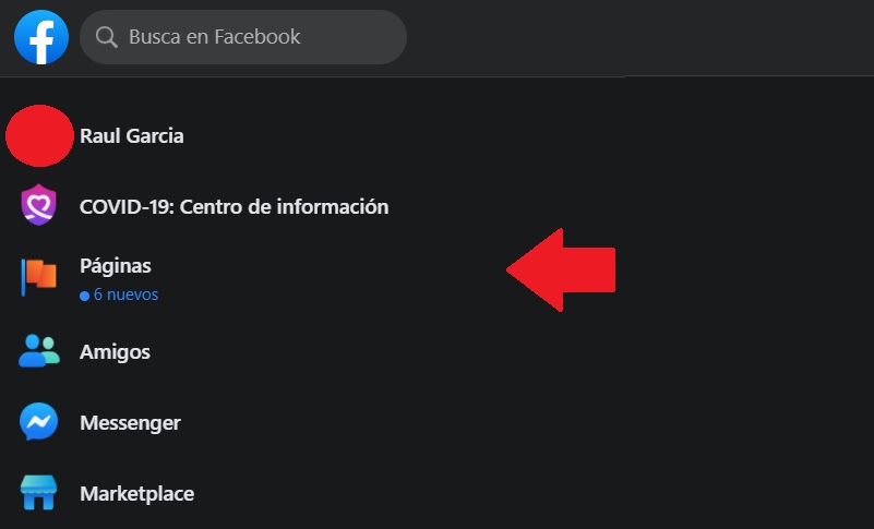
One of the main novelties that the new Facebook design brings with it is that it expands its ease of use, since it simplifies access to each and every one of its sections.
Above all, highlights its renewed left sidebar where we will have all our apps, pages and groups. While keeping the previous resemblance with your previous aspect, you have gained visibility, with a much more striking design and with a larger source size. In fact, Facebook have made great changes in the visual aspect, with texts with a larger, clearer font size and different visual elements of larger so that they are easy to see. In short, a fully polished profile page at a visual level with all the elements at the naked eye.
The new “Create” icon
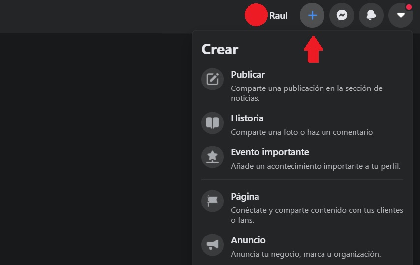
In general, all Facebook sections will be better defined and more accessible. If you look on the right side you will find all your notifications in your own feed with your own quick reactions. Another element to stand out from the right sidebar, and that has also suffered certain retouching, is the “+” icon, which will allow you to access directly to the creation of various content through a drop-down menu with all the options available at the naked eye. Thanks to this icon, you can create a page, publish an ad, create a new group, organize an event, make a marketplace publication, upload a history, make a fundraiser or simply publish a normal and current post. It is a very practical option, from which you can do everything from one place and not have to waste your time looking for the option you need from thousands of options.
The new top bar with shortcuts
We reach another of the most remarkable points of this redesign, the upper Facebook bar, where the most used options of the social network are grouped, so you can select the one you want comfortably and quickly. From left to right you would start by “start” icons, with the feed of the publications of our friends and the pages that you usually follow; And “pages”, from where you can quickly access the pages you manage. Next, comes the option to watch videos “Watch”, where you can see all the videos of the social network, including featured videos for you, the videos that you have saved, direct, as well as a list of videos of the pages you follow. The following icon corresponds to the “Marketplace”, from you can buy and sell everything, with several categories of products that are close to your location. Of course, you will have the possibility to edit all these filters to your liking. Finally, we have the “Groups” icon, from which you will have access to the groups to which you belong or are administering, as well as a good handful of suggestions that you can request to join. These are the main novelties that the renewed aspect of the social network of Facebook brings. While they are not so profound, they do provide a fresh air in terms of usability and speed in navigation, and help to familiarize ourselves with them quickly. And you, have you tried it? You may already have your invitation available when you enter next time. And if not, you will not have to wait too much to enjoy it.